
Building A Basic UI For Amplify Apps
This article is about building a basic UI using both AWS Amplify built-in React Components. This is part of the ongoing “notebook series” which serves as my personal notebook while learning new tools and techniques for rapid prototyping and development of cloud-hosted React apps.
For this article it is assumed the prior work has already been done as noted in the React App on AWS and Starting A New App On Amplify articles to initiate the app environment. The dev box environment is a MacOS laptop running WebStorm with AWS CLI installed.
Amplify UI Components
For these project we’ve already setup some default libraries, which helped with building the Cognito-based user authentication wrapper for our app. When you add @aws-amplify/ui-react node libraries to your project you get a set of pre-defined Amplify React components. These components augment the default components provided by React and create most of the rudimentary web UI elements you see in modern apps. They are nothing fancy, but are easily extendable and “skinnable” via the Amplify Theme system. We’ll deal with that sort of thing later.
For now, make sure you’ve added @aws-amplify/ui-react to your npm or yarn install lib. If you’ve followed the prior Amplify notebook posts you’ll already have that in place.
As a refresher, here is an example starting package.json for this project:
{
  "name": "stocker",
  "version": "0.1.3",
  "private": true,
  "dependencies": {
    "@aws-amplify/ui-react": "^5.2.0",
    "@testing-library/jest-dom": "^5.17.0",
    "@testing-library/react": "^14.0.0",
    "@testing-library/user-event": "^14.4.3",
    "aws-amplify": "^5.3.10",
    "react": "^18.2.0",
    "react-dom": "^18.2.0",
    "react-scripts": "5.0.1",
    "web-vitals": "^3.4.0"
  },
  "devDependencies": {
    "@babel/plugin-proposal-private-property-in-object": "^7.21.11"
  },
  "scripts": {
    "start": "react-scripts start",
    "build": "react-scripts build",
    "test": "react-scripts test",
    "eject": "react-scripts eject"
  },
  "eslintConfig": {
    "extends": [
      "react-app",
      "react-app/jest"
    ]
  },
  "browserslist": {
    "production": [
      ">0.2%",
      "not dead",
      "not op_mini all"
    ],
    "development": [
      "last 1 chrome version",
      "last 1 firefox version",
      "last 1 safari version"
    ]
  }
}
Basic UI Layout Using Amplify Components
Given the baseline components we can quickly prototype some app layouts and see them in on our local dev box. Using the standard node run command provided by the package.json a local browser will render the changes for us in real time as we play with the components.
Our index.js file is already configured to bring along the Amplify themes — here is the current state of that file:
// -- Default Create Create App libs
import React from 'react';
import ReactDOM from 'react-dom/client';
import './index.css';
import App from './App';
import reportWebVitals from './reportWebVitals';

// -- Amplify specific libs
// Add amplify libs to default creat react app template
import {ThemeProvider} from "@aws-amplify/ui-react";
import { Amplify } from 'aws-amplify';
import config from './aws-exports';
import "@aws-amplify/ui-react/styles.css";
import studioTheme from './ui-components/studioTheme';

Amplify.configure(config);

// -- Standard Create React App DOM connection to create the SPA
const root = ReactDOM.createRoot(document.getElementById('root'));
root.render(
  <React.StrictMode>
      <ThemeProvider theme={studioTheme}>
            <App />
      </ThemeProvider>
  </React.StrictMode>
);

reportWebVitals();
This wraps the entire App component in the Amplify theme handler.
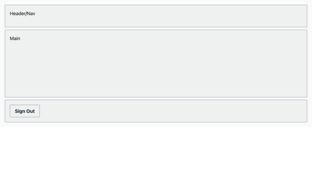
Now we can combine some of the default Amplify themes, in this case just to add some colors for visual clarity in the screen shots, with default Amplify React components. Let’s start with the Basic Amplify UI components to build a fairly standard Grid layout, here a simple header, main content area, and footer as for the first iteration I am not going to want a sidebar. A lot of content is mobile-centric these days, so sidebars are out for the moment.
Here is the App.js file with a basic grid layout and some Amplify React Components to visually show our grid structure. It starts by importing Amplify stylesheets and some components from the ui-react lib. We will use the default View component, a basic div rendering component to wrap the entire set, which helps with some of the responsive flex-based HTML that is generated. Inside we’ll use the <Grid> component, which is fairly common among React UI/UX Frameworks, to define out main structure; Grids are like tables built from divs using CSS flex rules (typically) and help the app expand and decompose nicely based on responsive HTML structures. We’ll use <Card> components to group things together, in this case creating a vertical stack of them by telling them to go from “colum 1” to the “last available column (-1)”.
Our App.js now looks like this:
import "@aws-amplify/ui-react/styles.css";
import {
  withAuthenticator,
  Button,
    Card,
    Grid,
  View,
    useTheme
} from "@aws-amplify/ui-react";

function App({ signOut }) {
  const { tokens } = useTheme();
  return (
      <View
          className="App"
          backgroundColor={tokens.colors.background.secondary}
          padding={tokens.space.medium}
      >
          <Grid
              columnGap="0.5rem"
              rowGap="0.5rem"
              templateColumns="1fr 1fr 1fr"
              templateRows="1fr 3fr 1fr"
          >
              <Card
                  variation="outlined"
                  columnStart="1"
                  columnEnd="-1"
                  backgroundColor={tokens.colors.background.tertiary}
              >
                  Header/Nav
              </Card>
              <Card
                  variation="outlined"
                  columnStart="1"
                  columnEnd="-1"
                  backgroundColor={tokens.colors.background.tertiary}
              >
                  Main
              </Card>
              <Card
                  variation="outlined"
                  columnStart="1"
                  columnEnd="-1"
                  backgroundColor={tokens.colors.background.tertiary}
              >
                  <Button
                      onClick={signOut}
                  >Sign Out</Button>
              </Card>
          </Grid>
      </View>
  );
}

// -- Wrap our app in the AWS Authentication lib
// this will control app access via the AWS lib
// in our case we've configured it to use Cognito, so that AWS service will be the main driver here
export default withAuthenticator(App);
If we’ve got everything setup properly we can see something like this if we are logged in:
If we are not logged in we see the default Amplify Authenticator wrapper that uses Cognito to register and authenticate our account:
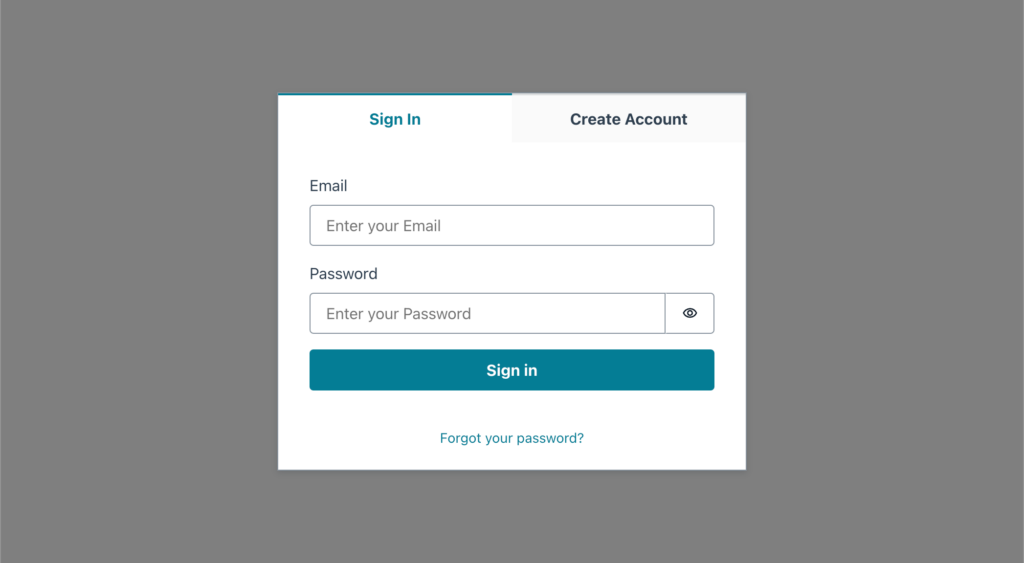
Why is the background color so much darker on our login/sign up screen? Because the default withAuthenticator wrapper will pull up the sign in / create account in a modal dialog box. Modal boxes are configured in Amplify Components to use a semi-transparent dark overlay. On a standard model this will darken anything on the page behind the modal giving it more of a “in the background/out of focus” appearance while putting emphasis on the modal content.
So far so good. Now let’s try playing with some more advanced UI stuff. While we could continue learning basic components, let’s fast forward to more advanced components and leveraging Figma to design them… that is next up in the Amplify “notebook series”.