
Using Figma To Create Amplify React Components
As we continue the learning experience with Amplify we are going to start moving on from a basic hosted React App with data structures and basic UI components to adding a little more style to our UI. This post is the next in the “Amplify notebook” series of posts and extends what we learned in Building A Basic UI For Amplify Apps
This article is about moving beyond the basic UI using AWS recommended tools like Figma to generate React Components. This is part of the ongoing “notebook series” which serves as my personal notebook while learning new tools and techniques for rapid prototyping and development of cloud-hosted React apps.
For this article it is assumed the prior work has already been done as noted in the React App on AWS and Starting A New App On Amplify articles to initiate the app environment. The dev box environment is a MacOS laptop running WebStorm with AWS CLI installed. Having a pre-existing Figma account is useful and downloading the desktop Figma app is in play here.
You can follow the Figma Getting Started for Amplify docs — they mirror, for the most part, those found on the Amplify docs site. I find the Figma site layout easier to read, thus the link to that site here.
Download The Figma App
While you can do all your component editing in browser-based tool that is similar to the original Adobe Photoshop tools, the component designer seems to behave more with the desktop app. The app is fairly lightweight and feels like a lightly-skinned web browser with a simplified menu interface. It also does a good job keeping your desktop work synced with the cloud account at Figma.
Personally I also like having the “save local copy” option to get a copy of my .figma file for this project saved alongside the Amplify React app code and config files.
Copy The AWS Amplify Studio Figma To Your Account
Go grab a copy of the Amplify Studio Figma file and make a copy of it that you save to your account. This will provide a stack of basic components you can quickly sync with Amplify Studio and then import into your local AWS Amplify app. It will give you the ability to import a npm file and then use new React Components in your app , providing a great starting point for writing custom interactive components in your app.
The current link to the community Figma file at the time or writing is : https://www.figma.com/community/file/1047600760128127424
Link Your Copy Of The Figma To Your AWS Amplify Studio
You should already have an AWS Amplify app up-and-running if you’ve followed the prior notebook examples. Login to AWS console, go to the backend tab for your Amplify app, and click on “Launch Studio”.
You can follow the instructions in the Figma/Amplify Studio documentation for how to find and copy your Figma URL (the URL for your version of the Figma file you made a copy of) into the setup dialog. If done properly the AWS Amplify Studio will sync the contents of the Figma file to Amplify.
From there you can tweak the behavior of the Figma components to do things like make a Navbar menu entry link to a specific URL or turn various React component properties into data driven properties.
A key takeaway here is that Figma designs the LOOK of the components. You sync those to Amplify Studio where you can use the AWS Amplify Studio web interface to add properties like onClick actions or change components to be data-driven — attaching application logic to the Figma UI to create a User Experience (UX).
Test The Figma / Amplify Studio / Local Dev Sync
To test the sync and ability to use components in the app , leave the components as-is. Go to Amplify Studio and sync the Figma file.
When complete, look at the local deployment steps. You should see a command to open a terminal window on your local dev box and perform an amplify pull command (part of the CLI). You may need to specify your app ID in the first attempt (the long form, explicit version, of amplify pull). This pull command will download the code files, React component JavaScript to your local dev box. It typically ends up in the ui-components directory.
You can then include and use those components like any other self-created component.
Here is my starting App.js file as an example:
import "@aws-amplify/ui-react/styles.css";
import {
  withAuthenticator,
  Button,
    Card,
    Grid,
  View,
    useTheme
} from "@aws-amplify/ui-react";
import {
    NavBar
} from './ui-components';

function App({ signOut }) {
  const { tokens } = useTheme();
  return (
      <View
          className="App"
          padding={tokens.space.zero}
      >
          <Grid
              templateColumns="1fr"
              templateRows="1fr 3fr 1fr"
          >
              <NavBar />
              <Card
                  variation="outlined"
                  columnStart="1"
                  columnEnd="-1"
                  backgroundColor={tokens.colors.background.tertiary}
              >
                  Main
              </Card>
              <View
                  columnStart="1"
                  columnEnd="-1"
                  padding={tokens.space.medium}
              >
                  <Button
                      onClick={signOut}
                  >Sign Out</Button>
              </View>
          </Grid>
      </View>
  );
}

// -- Wrap our app in the AWS Authentication lib
// this will control app access via the AWS lib
// in our case we've configured it to use Cognito, so that AWS service will be the main driver here
export default withAuthenticator(App);
Play With the Figma Components
While there are multiple pages in the Amplify Studio Figma file, ONLY the My Components page is exported and synced to Amplify Studio for use in your app. You can remove or add any component you want to that page to make it available to your app.
To start, I left all the components in place even though I won’t need most of them.
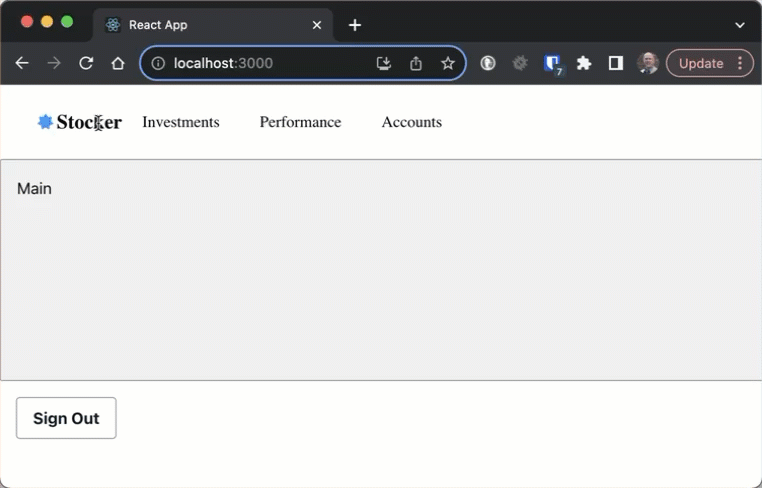
The only component being used for now is the Navbar component, which will will drop on the top of our current example application.
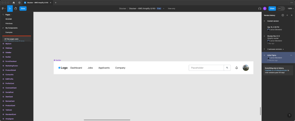
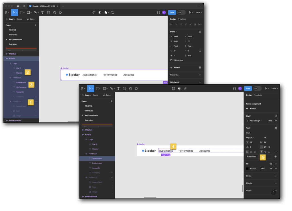
Since I don’t want those menu items or the right navbar elements for the initial revision, I’ll edit the Navbar component in Figma. Select Page on the top right panel, and click My Components to pick that page. Now with that page active find the Navbar component (left sidebar) and bring it into focus on the design pane on the right.
For my design I hid the right search/notification/avatar, changed the Logo to the app name, and updated the menu entries. This has been saved to Figma which can then be imported (synced) via Amplify Studio on the AWS Console website.
Now I want to bring the design over to Amplify Studio so I can attach some actions to it via the web interface.
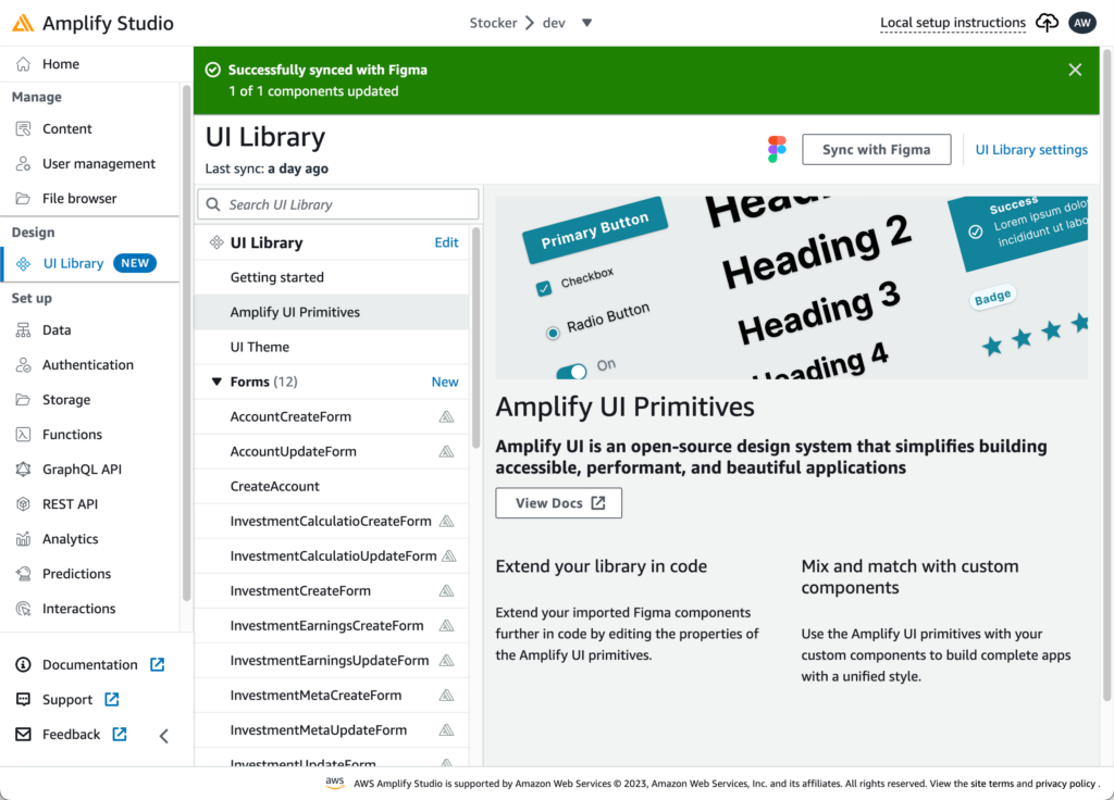
Click the Sync with Figma button under “UI Library” in the Amplify Studio web console.
Accept all the changes then add some actions.
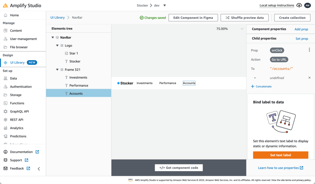
From within the UI Library section of Amplify Studio look for the Navbar component, click on it and click configure to add actions like onClick via the right sidebar properties list. Here I’m preparing to add routes to the application by specifying relative URLs that will later be used to load the components within the main frame of the app based on the menu item selected.
In this image it is to open the /accounts/ route for managing the list of accounts.
Follow the local setup instructions, which tell us to go to the local dev box and use the Amplify CLI command amplify pull to fetch the new component code. We can then implement that into our App by including the generated component code and adding the <Navbar/> element to our React app main page.
Our App.js is unchanged as the code updates from Figma and Amplify Studio end up in the auto-generated Navbar component JS. Here is App.js now:
import "@aws-amplify/ui-react/styles.css";
import {
  withAuthenticator,
  Button,
    Card,
    Grid,
  View,
    useTheme
} from "@aws-amplify/ui-react";
import {
    NavBar
} from './ui-components';

function App({ signOut }) {
  const { tokens } = useTheme();
  return (
      <View
          className="App"
          padding={tokens.space.zero}
      >
          <Grid
              templateColumns="1fr"
              templateRows="1fr 3fr 1fr"
          >
              <NavBar />
              <Card
                  variation="outlined"
                  columnStart="1"
                  columnEnd="-1"
                  backgroundColor={tokens.colors.background.tertiary}
              >
                  Main
              </Card>
              <View
                  columnStart="1"
                  columnEnd="-1"
                  padding={tokens.space.medium}
              >
                  <Button
                      onClick={signOut}
                  >Sign Out</Button>
              </View>
          </Grid>
      </View>
  );
}

// -- Wrap our app in the AWS Authentication lib
// this will control app access via the AWS lib
// in our case we've configured it to use Cognito, so that AWS service will be the main driver here
export default withAuthenticator(App);
And the auto-generated ui-components/Navbar.jsx:
/***************************************************************************
 * The contents of this file were generated with Amplify Studio.           *
 * Please refrain from making any modifications to this file.              *
 * Any changes to this file will be overwritten when running amplify pull. *
 **************************************************************************/

/* eslint-disable */
import * as React from "react";
import {
  getOverrideProps,
  useNavigateAction,
} from "@aws-amplify/ui-react/internal";
import { Flex, Icon, Text } from "@aws-amplify/ui-react";
export default function NavBar(props) {
  const { overrides, ...rest } = props;
  const stockerOnClick = useNavigateAction({ type: "url", url: "/" });
  const investmentsOnClick = useNavigateAction({
    type: "url",
    url: "/investments/",
  });
  const performanceOnClick = useNavigateAction({
    type: "url",
    url: "/performance/",
  });
  const accountsOnClick = useNavigateAction({
    type: "url",
    url: `${"/accounts/"}${""}`,
  });
  return (
    <Flex
      gap="20px"
      direction="row"
      width="1440px"
      height="unset"
      justifyContent="center"
      alignItems="center"
      position="relative"
      padding="24px 32px 24px 32px"
      backgroundColor="rgba(255,255,255,1)"
      {...getOverrideProps(overrides, "NavBar")}
      {...rest}
    >
      <Flex
        gap="2px"
        direction="row"
        width="unset"
        height="24px"
        justifyContent="center"
        alignItems="center"
        shrink="0"
        position="relative"
        padding="0px 0px 0px 0px"
        {...getOverrideProps(overrides, "Logo")}
      >
        <Icon
          width="18px"
          height="18px"
          viewBox={{ minX: 0, minY: 0, width: 18, height: 18 }}
          paths={[
            {
              d: "M8.12249 1.60573C8.50171 0.911796 9.49829 0.911796 9.87751 1.60573L10.9602 3.58693C11.1657 3.96292 11.5879 4.16622 12.0099 4.09244L14.234 3.70368C15.0129 3.56751 15.6343 4.34666 15.3282 5.07581L14.4543 7.15757C14.2884 7.55264 14.3927 8.00946 14.7135 8.29344L16.4041 9.78987C16.9963 10.314 16.7745 11.2856 16.0136 11.5009L13.8412 12.1156C13.4289 12.2323 13.1367 12.5986 13.1147 13.0265L12.9989 15.2813C12.9583 16.071 12.0604 16.5034 11.4176 16.0427L9.58254 14.7275C9.23429 14.4779 8.76571 14.4779 8.41746 14.7275L6.58236 16.0427C5.9396 16.5034 5.04172 16.071 5.00113 15.2813L4.88526 13.0265C4.86327 12.5986 4.57112 12.2323 4.15884 12.1156L1.98638 11.5009C1.22546 11.2856 1.0037 10.314 1.59585 9.78987L3.28646 8.29344C3.6073 8.00946 3.71156 7.55264 3.54571 7.15757L2.6718 5.07581C2.36571 4.34666 2.98706 3.56751 3.76604 3.70368L5.99007 4.09244C6.41214 4.16622 6.83431 3.96292 7.03978 3.58693L8.12249 1.60573Z",
              fill: "rgba(20,155,252,1)",
              fillRule: "nonzero",
            },
          ]}
          display="block"
          gap="unset"
          alignItems="unset"
          justifyContent="unset"
          shrink="0"
          position="relative"
          {...getOverrideProps(overrides, "Star 1")}
        ></Icon>
        <Text
          fontFamily="Inter"
          fontSize="20px"
          fontWeight="600"
          color="rgba(0,0,0,1)"
          textTransform="capitalize"
          lineHeight="24.204544067382812px"
          textAlign="left"
          display="block"
          direction="column"
          justifyContent="unset"
          width="unset"
          height="unset"
          gap="unset"
          alignItems="unset"
          shrink="0"
          position="relative"
          padding="0px 0px 0px 0px"
          whiteSpace="pre-wrap"
          children="Stocker"
          onClick={() => {
            stockerOnClick();
          }}
          {...getOverrideProps(overrides, "Stocker")}
        ></Text>
      </Flex>
      <Flex
        gap="40px"
        direction="row"
        width="1261px"
        height="unset"
        justifyContent="flex-start"
        alignItems="center"
        shrink="0"
        position="relative"
        padding="0px 0px 0px 0px"
        {...getOverrideProps(overrides, "Frame 321")}
      >
        <Text
          fontFamily="Inter"
          fontSize="16px"
          fontWeight="400"
          color="rgba(0,0,0,1)"
          lineHeight="24px"
          textAlign="left"
          display="block"
          direction="column"
          justifyContent="unset"
          letterSpacing="0.01px"
          width="unset"
          height="unset"
          gap="unset"
          alignItems="unset"
          shrink="0"
          position="relative"
          padding="0px 0px 0px 0px"
          whiteSpace="pre-wrap"
          children="Investments"
          onClick={() => {
            investmentsOnClick();
          }}
          {...getOverrideProps(overrides, "Investments")}
        ></Text>
        <Text
          fontFamily="Inter"
          fontSize="16px"
          fontWeight="400"
          color="rgba(0,0,0,1)"
          lineHeight="24px"
          textAlign="left"
          display="block"
          direction="column"
          justifyContent="unset"
          letterSpacing="0.01px"
          width="unset"
          height="unset"
          gap="unset"
          alignItems="unset"
          shrink="0"
          position="relative"
          padding="0px 0px 0px 0px"
          whiteSpace="pre-wrap"
          children="Performance"
          onClick={() => {
            performanceOnClick();
          }}
          {...getOverrideProps(overrides, "Performance")}
        ></Text>
        <Text
          fontFamily="Inter"
          fontSize="16px"
          fontWeight="400"
          color="rgba(0,0,0,1)"
          lineHeight="24px"
          textAlign="left"
          display="block"
          direction="column"
          justifyContent="unset"
          letterSpacing="0.01px"
          width="unset"
          height="unset"
          gap="unset"
          alignItems="unset"
          shrink="0"
          position="relative"
          padding="0px 0px 0px 0px"
          whiteSpace="pre-wrap"
          children="Accounts"
          onClick={() => {
            accountsOnClick();
          }}
          {...getOverrideProps(overrides, "Accounts")}
        ></Text>
      </Flex>
    </Flex>
  );
}
As we click each top Navbar menu element we can see the URL changing, ready to go for the React routing.
Next up – adding React routing and forms to our Amplify App.