
Consistent UI Design Is A Challenge For AI
Anyone that has been following my blog knows I am far more on the skeptical side when it comes to what AI can do. While artificial intelligence has made notable strides in the past few years, it still has a long way to go before it becomes a master at most fields. Yes, it plays Go (Move 37) , Chess, and even Starcraft II fairly well. It creating decent images most of the time these days. But for things that matter, it still needs a lot more training and coaching from professionals and experts.
My particular expertise is in technology, especially coding languages. I may not be the “best of the best” in any one language , but I do have more than 4 decades of experience writing software. I’ve have a solid understanding of best practices and writing performant applications in several languages. I know enough to clearly see poor design patterns that lead to brittle code or solutions that will incur long term technical debt. I also know what it takes to launch successful mobile and web applications with a dozen or so large scale applications having been launched over the past decade – many of which are still running today.
For the past couple of years I’ve been pushing various AI tools to assist in writing or maintaining applications. I often find the edge of the capabilities of the tools and AI models very quickly. I’ve already fond the failures in building RAG systems, MCP servers, and ACP servers that do not fall neatly into the “well everyone does it this way” patterns.
I want AI tool kits that can build fully functional and WELL CRAFTED web applications by feeding them a complete and well designed set of application architecture documents. My latest project, a theoretical Travel App that is meant to replace my crazy complex spreadsheet system has been designed from the start as an AI centric project. Let the AI refine the architecture and write most of the code. I provided an in depth set of markdown files describing the features, use cases, IT stack, SDLC processes, and more. All the things I would hand to a third party vendor when contracting a large scale web application for a client.
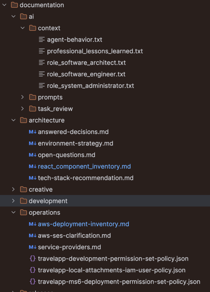
While the AI agent has generally done an OK job, it has required a LOT of handholding. Countless hours have gone into training, retraining, and training the AI agents. Too much time has been spent fixing drift even over short context windows. Too many times the AI agents skip primary rules in the bootstrap AGENTS.md files. I cannot count the number of times an agent has spent far too many tokens on a task, proclaim the task is complete and miss several explicit requirements despite proclaiming the work is done.
In general AI is still a mediocre-to-subpar full stack engineer. And that is on a good day.
UI/UX Consistency
One of the core tenants that the AI agents have been trained on for the Travel App since day one is “consistency is key”. User interface design MUST be consistent. Same size buttons. Same font family. Same wireframes (screen layout) throughout the application. Same with user experiences, do not provide one-click inline edits on one page of the app, but old school 1990’s style forms and save/cancel buttons on another page. Don’t display a pointer cursor on some buttons but not others. BE CONSISTENT.
Yet, even with the latest-and-greatest OpenAI Codex running GPT-5.6 Sold on High reasoning it often misses the mark. Sure, with the dozens of training files the initial results are often better. However even with some basic interface updates the latest AI models STILL continue to miss the mark and require several turns to get basic interface elements to be consistent.
One such example is noted in the image below. The main itinerary view and the secondary account view still show numerous UI inconsistencies despite several context sessions and multiple turns trying to get the AI agent to understand basic principles. Here simple things like “the sidebar for the itinerary view is clickable, but not on the account page”. Or “the main application bar hamburger menu is missing Manage trips on the account page”. Or basic UI elements like using a pointer cursor when hovering over interactive action elements on the user interface. They were all missed despite explicit instructions calling out these issues.
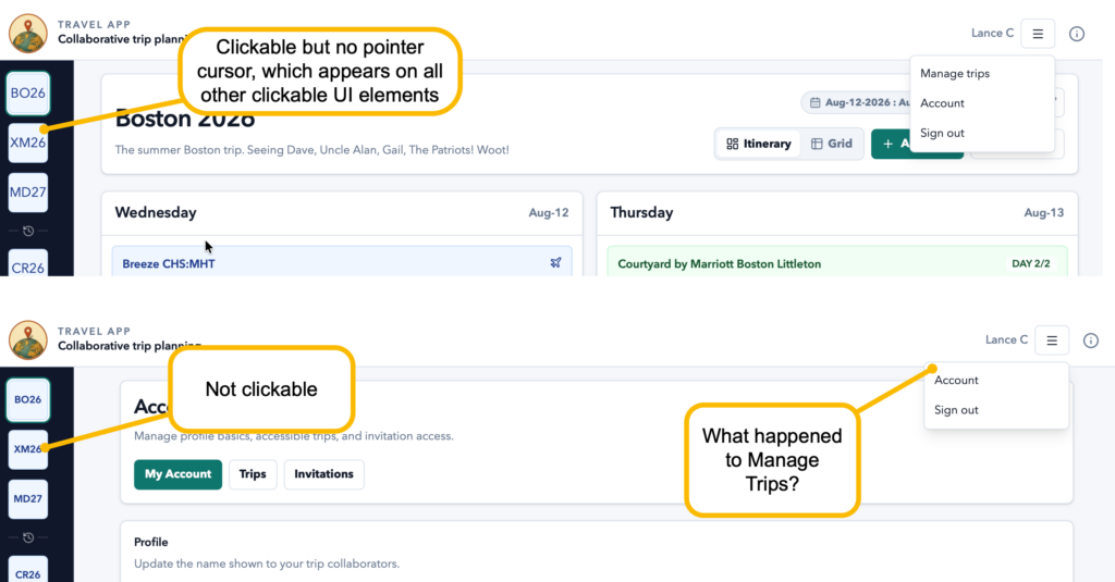
In order to fix these interface inconsistencies, I had to create an entirely new context and spell out with painstaking details what was wrong and how each element should be fixed. That process should not be required , especially since the Codex GPT-5.6 agent created both interfaces when it built the initial version of the applications. A few dozen sessions later it still cannot get this right.
Sure, easy to miss, right?
Well, that is the problem. From the very first implementation that happened over 50 session ago I reviewed the code. There were problems. Lots of problems. The entire application was architected in a way that was extremely brittle. Something you’d expect from a first year coder that has had zero formal training. Granted some of the data design and implementation was impressive. And fast. But for an application meant to be maintainable and easily extended over time, it was awful.
Choosing Custom Components Over A Framework
Nearly EVERY component and piece of the application was custom crafted. This is despite guiding the AI to use well defined frameworks where reusable interface components, that are well tested I might add, are readily available. Hell, during the initial week-long interview process where the AI agent asked clarifications questions it chose the style framework and component framework to use for the application. Did it employ the components in the framework it chose? NOPE not at all. The first iteration of the application wrote 100% custom components throughout.
Custom components are quick way to create lots of brittle code that requires tons of maintenance. Sure if I was billing clients by the hour or by the line of code , as many “coder for hire shops” do, this would be great. But I want my AI agents to write EFFICIENT and easily maintainable code, not “great for your consulting firm billing hours bottom line” code. Come to think of it , that is likely part of the issue as an insane amount of public code is barfed out by bill-by-the-hour coding agencies over competent coders – but that is another story.
The thing about reusable components, like a card interface or a slide out drawer, or a “hamburger menu” is that they are CONSISTENT. They will always look and operate the same way every time. But if you custom-craft your menu component it may be different on one page of your app. This is exactly what the first version of the Travel App looked like. Buttons of different heights and colors, even on the same page. It was a mess.
Inconsistent Implementation Of Components
Now the AI agent is far better at using standard components provided by the framework, but it is still not sharing components within the application. Take the left sidebar for example. It is now built using standard Badge components that present the Trip shorthand in the left sidbar. They all look and work the same. That’s great.
The AI agent even created a custom component, which is not a bad thing if properly employed, called a “TripRail” that renders the left sidebar as a stack of badges with a current and past trips section. That’s also a good design.
Where the AI agent failed, is in deploying the TripRail in the sidebar.
The entire application since day one was to use a common wireframe layout for web apps. Use a common “Application Bar” across the top of the page, full width of the screen. Logo top left, app name next. Action buttons and the application menu (hamburger menu) far right. Down the left side a common shared sidebar. The rest of the page is the content area that changes based on what you are doing in the app. Constant consistent top bar, constant consistent left bar.
Here we are 50+ iterations in and the damn AI agent STILL creates an interface where it MODIFIES the top application bar and left sidebar for every page. I have even hand-edited the code to strip out special parameters passed to the sidebar and application bar that is making them render differently. Five interactions later when working on completely unrelated tasks, the AI agent decides the ONLY WAY to implement a new feature is to piss all over the consistent sidebar or application header.
The most recent turn, literally added a new parameter to the sidebar that the AI agent called “Interactive” and then decided to pass FALSE to this when the user is on their account page. Seriously? Are you kidding me? “On this one page, turn that shit off… display it but don’t let anyone interact with it”. YO… AI bot dude… WTF… what happened to “CONSISTENT SIDEBAR AND APP HEADER”.
Similar logic followed when updating the application menu. The AI decided that since the Account page has a way to manage trips, it wasn’t needed on the menu any longer. All other pages start with “Manage Trips” on the menu. EXCEPT the account page. The AI agent decided on its own accord that this was not needed DESPITE multiple commands “DO NOT CHANGE THE SHARED APPLICATION MENU”. The agent decided it knows better and I must have left that off my instructions.
Inference = Assumptions
Therein lies the problem. All of these AI interaction surfaces, including Codex inside of my coding tools, read exactly what you wrote then INFER what you actually meant. They GUESS as to what you meant to say versus what you said.
In one of my favorite analogies for how these AI interfaces work is a roulette wheel. They are nothing but giant probability engines. A crazy complex roulette wheel that spits out patterns of letters and symbols. To keep the output from being completely random they add the equivalent of magnets to the back of the letters and symbols to coax the bouncing metal ball to land where they want with higher probability.
Yes, it is far more complex than that , but the general premise remains the same – sometimes the AI agent will infer what you meant and the bouncing ball ended up on some random spots on the wheel that were not anticipated.
In the end that makes for an AI coding agent that is not always going to do the same thing twice.
This is called inconsistency.
Same information goes in, but the output is NOT always the same.