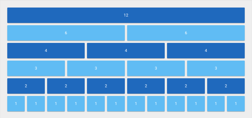
Vuetify 12-Point Grid Layouts
While updating an inherited web project, I’ve been slowly introducing some well-defined libraries to the mix. My current favorite being Vuetify — designed to add some decent style standards to reactive Vue components. This happens to be what I’ve chosen for the overwhelming task of modernizing the Store Locator Plus plugin UX (you’ll see the first hints on the forthcoming Add Locations interface in the next release) as well as for several other “clean slate” projects.
If you are writing web apps and are not familiar with CSS standard libraries or haven’t heard of the “12-point Grid System” you should start learning it. It will save a lot of time building web and mobile apps that are responsive. Libraries like Vuetify and Foundation for Sites with only the CSS components are well-tested with pre-defined rules that not only you will learn and be able to re-use but you’ll likely find many other web developers are already familiar with this configuration.
What is a 12-point Grid system?
Think of every part of a page that employs these CSS rules as divided into 12 equally-spaced columns that we can add together to define our layout.
The system will typically use the Flexbox rules that all modern web browsers support. This makes is far easier to define the layout of a page but also allows the elements to easily “collapse” into columns instead of rows on smaller screens. It is a whole lot better than the old-school HTML table hacks we had to deal with back in the early days of Netscape and Mozilla.

Many web apps now use this system as 12 columns provides enough granularity for most site content widths without a need to add hard-coded “column breaks” on a page. With most of these systems you can “roll your own” rule set and change to a 10-column or 25-column system by downloading the full SCSS ruleset and changing one line in the settings file.
I prefer not to do that as you then need to compile and minify the SCSS into a final min.css for daily use. My go-to is to install the latest library using NPM and grabbing only the standard already minified “full boat” CSS. This also makes it a whole lot easier to find online reference material with examples you can snarf verbatim.
Real-World Vuetify example
Here are the notes from a project journal that will help clarify how as 12-point grid can be used:
Updated Layout With Vuetify 12-point Grid
https://vuetifyjs.com/en/layout/grid
The home page form is set to a standard “layout row” with “justify center” = take the full width as defined by the HTML that surrounds it (prior devs limit THAT part of the page to 500-something pixels). Inside of that center our first 2 input boxes.
Box 1: Country = xs12 md3
On “medium-sized screens and larger” (think tablets and bigger) use 3 of the 12 (25%) of the width.
On anything smaller (xs up to but not including md size) use the entire width.
Box 2: Village = xs12 md4
Medium screens: use 4/12 (33%) of the screen.
Anything smaller: entire width
Box 3 (for now): Go = xs2
All screens use 2/12 (16%) of the screen.
Or in English: Layout the boxes centered on a row, using 25% for country, 33% for village, and small bit on the end for the Go button. If the screen gets narrow, stack them on top of each other taking the full width.
This “row on tablets or bigger” and “stack on mobile” is what they mean when they say “responsive design”.
There is one side effect of this approach — the CSS only without the Vuetify.JS (remember, it changes the entire look of the home page if I add the Vuetify code logic) does NOT automatically re-center the boxes on the row when the Go button magically appears. CSS is a “dumb layout control” and can only calculate “how to center things” based on what is VISIBLE when the page is first rendered. Since we’re taking out the “Go” button, a non-issue.
It is a lot more than that
This is only a very simple example of using a Vuetify 12 point grid in a real-world app. If you are not familiar with these approaches to app design and development I suggest you do some reading on the subject. There are a lot of better articles than this — and if you are always trying to improve your dev skills like I am you’ll likely find these libraries will help you take a big leap forward in your UX deliverables.
Have some resources to share on the topic? Please do so in the comments below!
